Coached by Greeny
Coached by Greeny is a premium online body transformation coaching brand that helps individuals achieve their fitness goals through tailored training, expert guidance, and structure. With no existing identity in place, the goal was to create a professional, sleek, and high-performing brand that would stand out across social media and reflect the quality of service Greeny offers.
Client
Coached by Greeny
Industry
Fitness & Coaching
Work
Branding | Social Media | Strategy

Complete Brand & Visual System
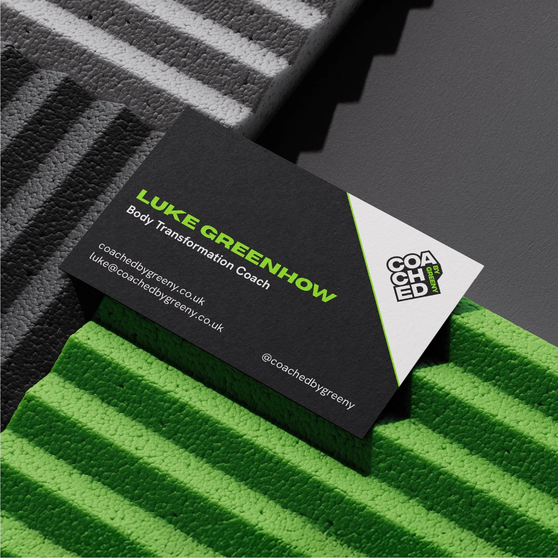
Delivering a complete brand identity system, including a bold primary logo with flexible variations for digital use. The brand guidelines covered typography, colour palette, layout rules and tone of voice, ensuring consistency and clarity across all touch points. Social media templates were also designed to create high-impact, on-brand content with ease.
The result is a sleek, professional identity built to grow with the business and stand out in a competitive online fitness space.

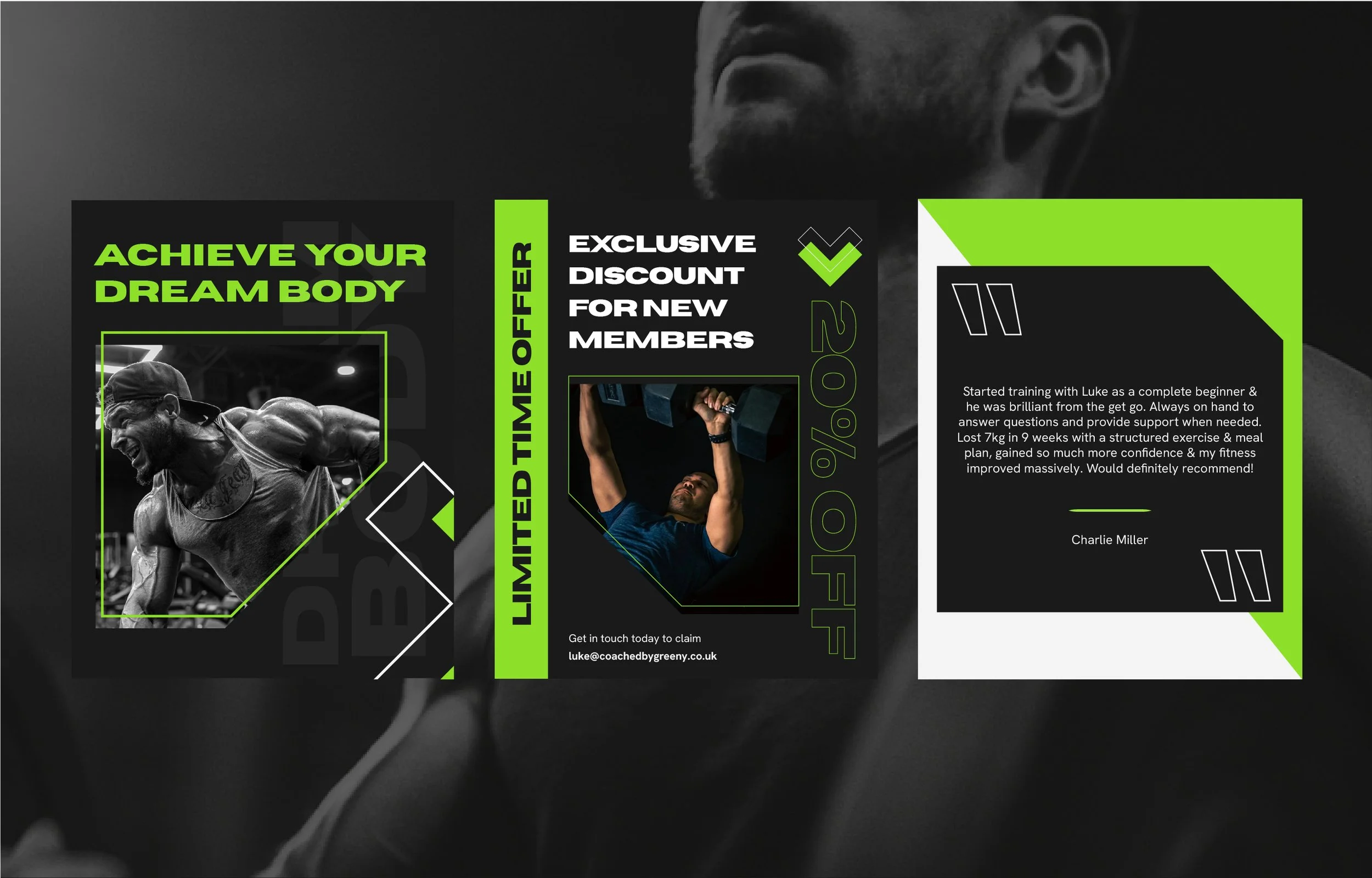
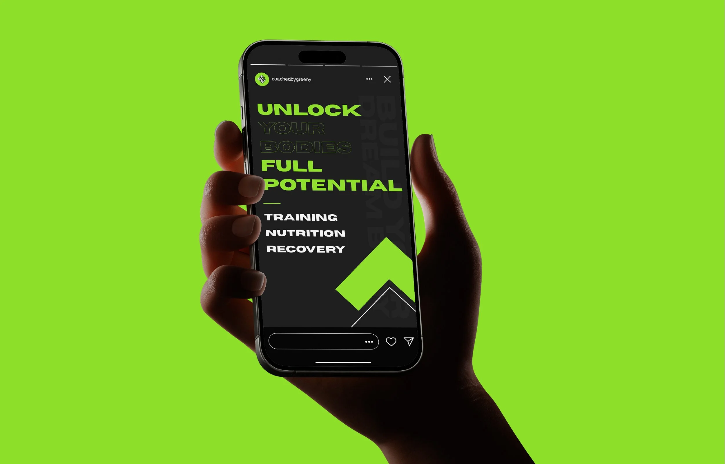
Social Media Strategy & Content Design
To support the brand’s growth online, I developed a tailored social media strategy alongside a suite of custom content templates. Designed for consistency and impact, these assets help Coached by Greeny show up confidently across platforms, making it easier to share client wins, expert tips, and branded messaging in a way that’s both professional and engaging.


Designing with Purpose and Precision
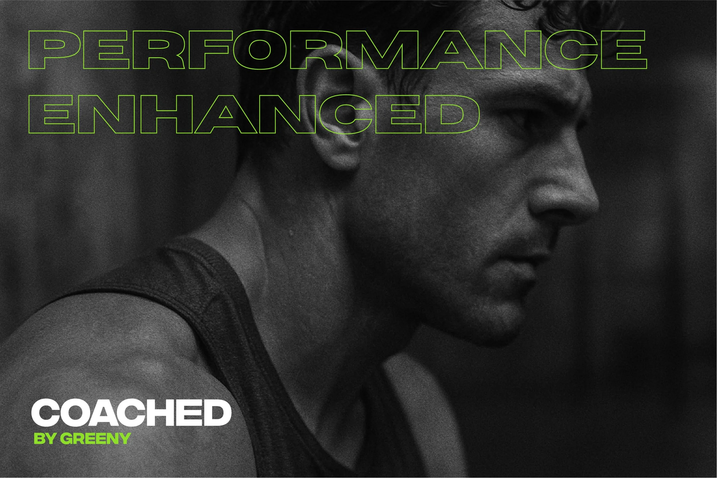
During the design process, working closely with Coached by Greeny, we explored multiple visual directions, eventually landing on a strong, modern identity that balances confidence with clarity. A striking black and neon green colour palette was chosen to reflect energy, performance and individuality tying into Greeny’s name and ethos.
Every design decision was grounded in function. From the typography to the logo structure, the aim was to create an identity that felt premium, powerful, and unmistakably fit for purpose, ready to stand out on social feeds, training content and also physically, like merch and printed material.


“Aidan did an incredible job bringing my brand to life. He understood my vision and turned it into a clear and professional identity that feels true to me. Creative, easy to work with and nailed it first time. Highly recommend!”
Luke Greenhow
Owner | Coached by Greeny