The Stirland Approach
Brand identity and website redesign for a modern movement methodology.
The Stirland Approach was entering a new phase of growth. The reputation and expertise were already there, but the brand and website no longer reflected the quality of the work or the direction of the business. This project focused on evolving the brand, refining the story and building a website that clearly explains the methodology while removing friction from bookings and memberships.
Industry
Movement, Performance and Wellbeing
Work
Brand Identity, Brand Guidelines, Website Design & Development
Website
www.thestirlandapproach.com
Refreshing a brand that was struggling to keep up
The Stirland Approach had built a strong following through in-person work and partnerships, but the digital presence had not kept pace.
They faced many challenges:
• A confusing website for clients and internal team
• Inconsistent visuals and messaging across pages
• Friction in the booking and membership journey
• A methodology that was not clearly articulated online
The core issue was clarity. If the business struggled to clearly explain the approach online, new users would too.
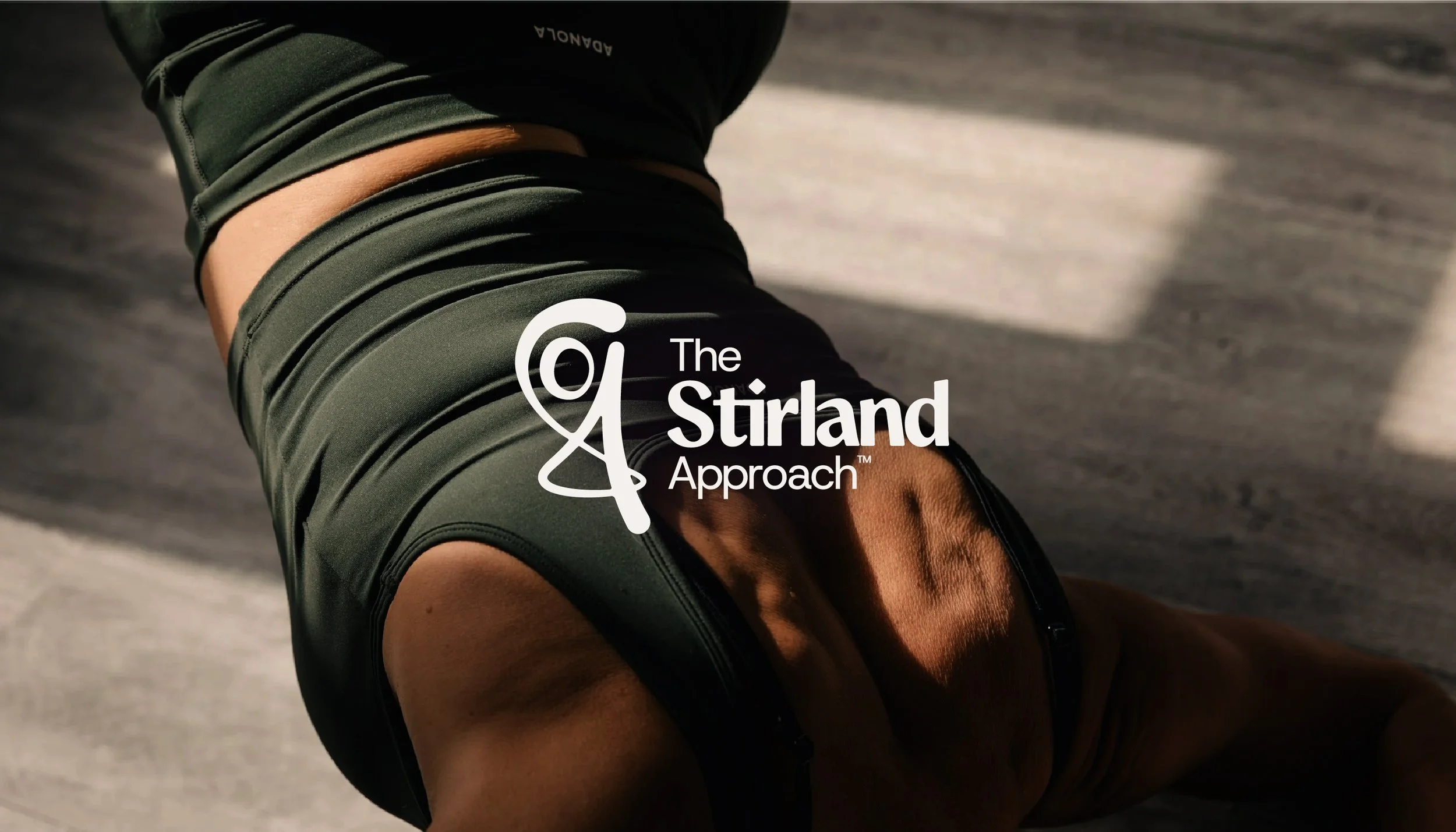
Movement and clarity is formed
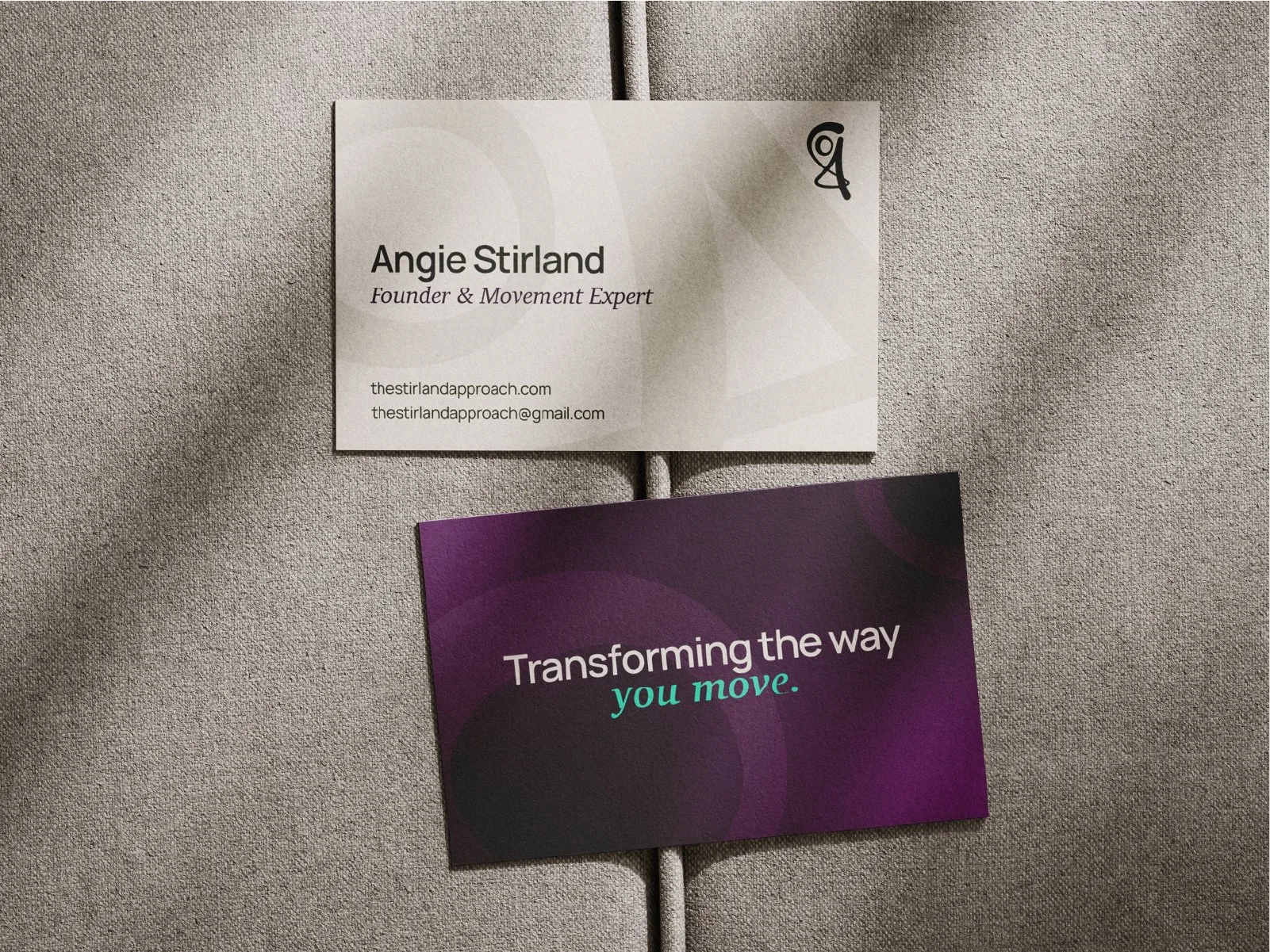
The new identity was designed to feel calm, confident and grounded. The aim was to create a premium but human movement brand that reflects expertise without feeling clinical or intimidating. The visual language balances structure and flow, mirroring the methodology itself, controlled, considered and built on strong foundations.
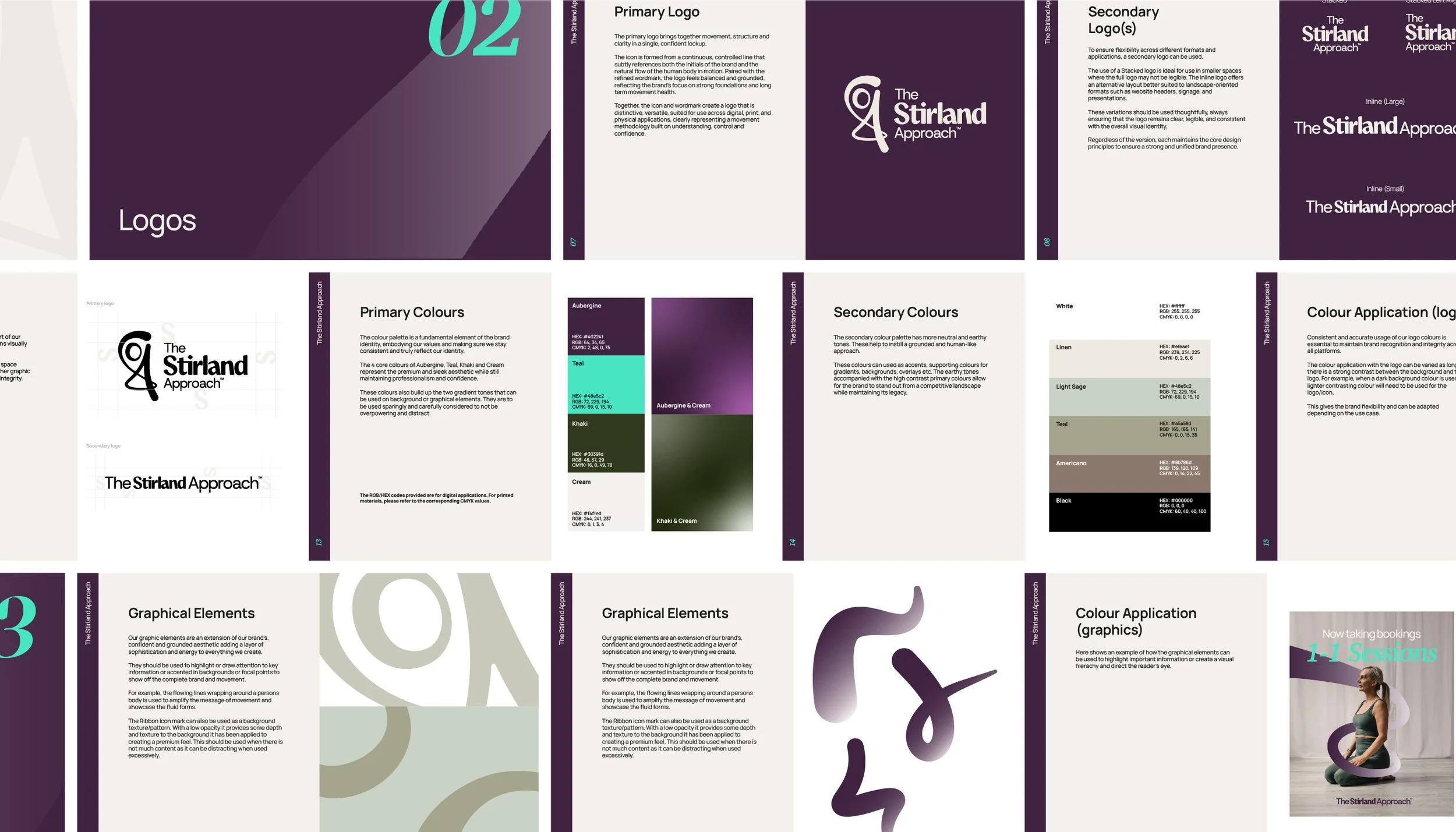
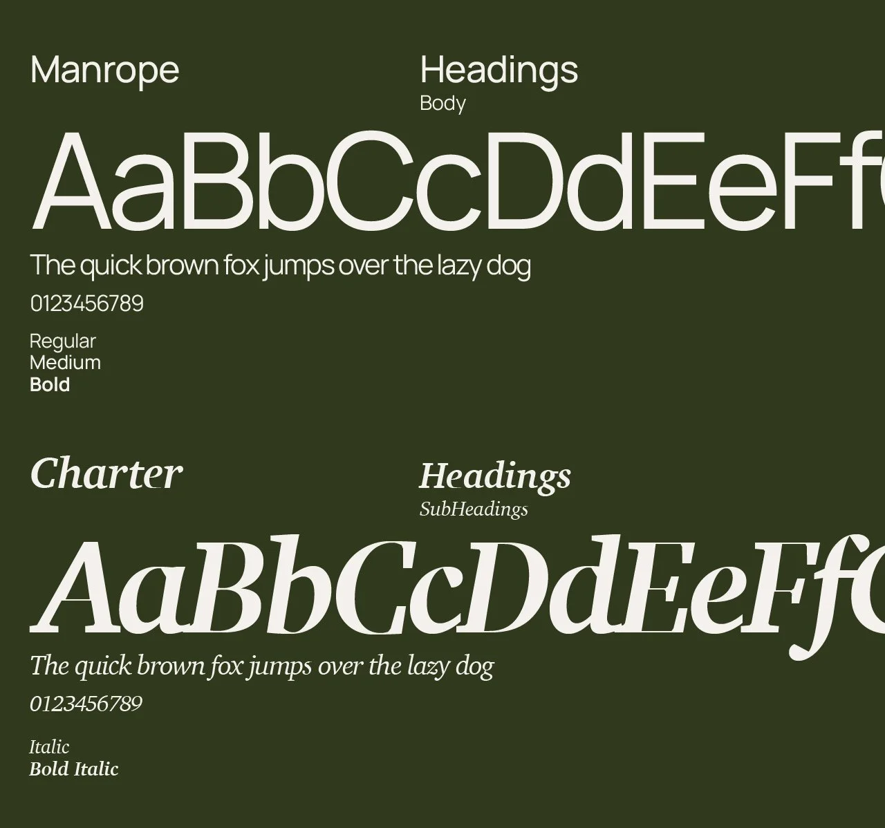
A refined logo system was developed with primary and secondary marks to ensure flexibility across digital, social and physical applications. The colour palette leans into earthy, muted tones, paired with higher-contrast accents to give the brand depth while maintaining clarity and professionalism. Typography was carefully selected to feel modern, legible and credible, supporting both long-form explanation and clear functional messaging.

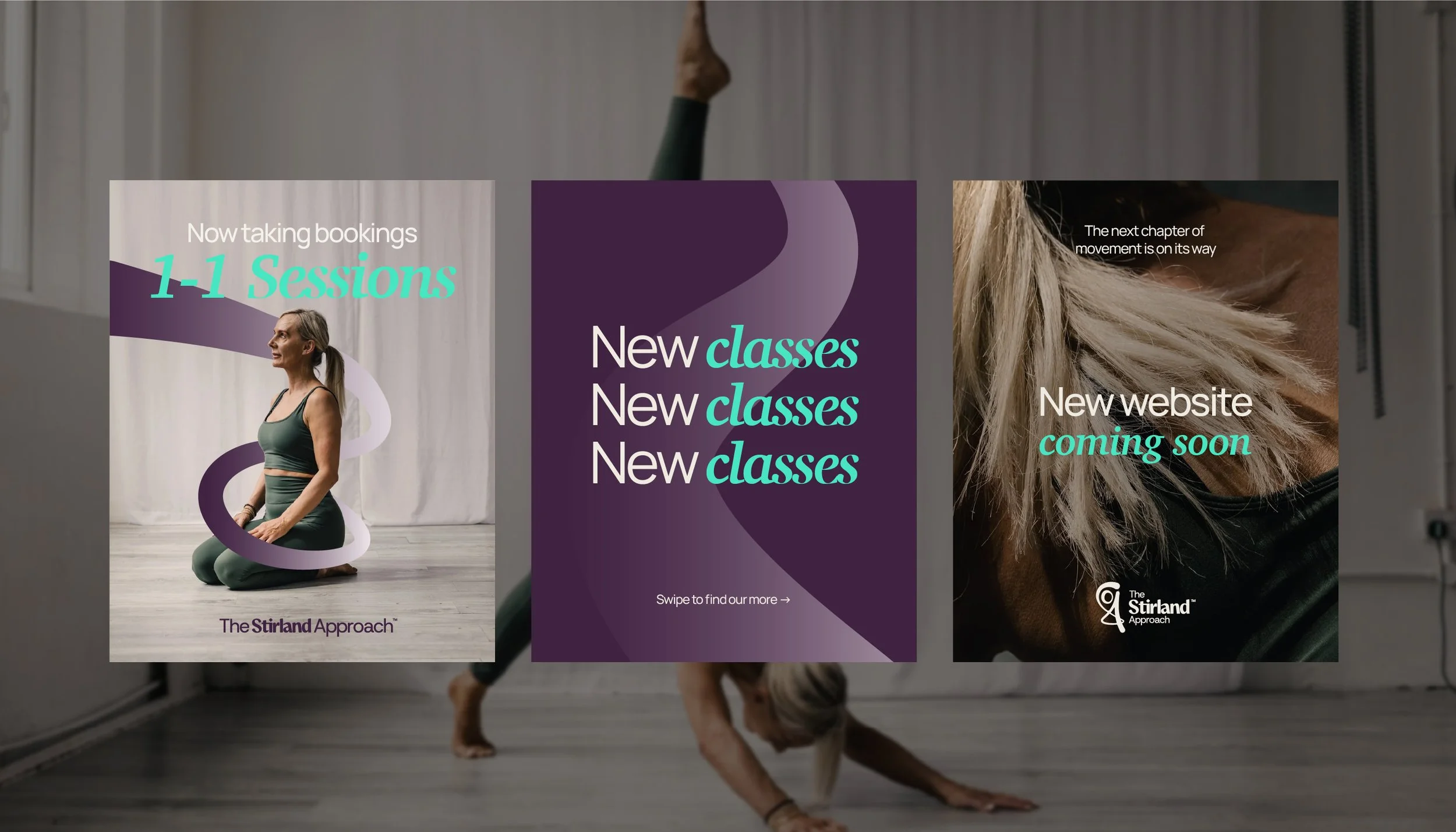
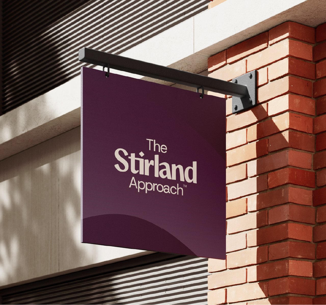
Consistency across all platforms
The purpose was to add character and consistency, helping the brand feel distinctive while remaining restrained and purposeful. Alongside the visual identity, a clear tone of voice was defined, confident, calm and supportive, focused on long-term progress rather than quick wins.
All of this was brought together in a concise brand guidelines system. This gives The Stirland Approach a solid foundation for future growth and ensures the brand can be applied consistently across the website, social media and any future touch points.

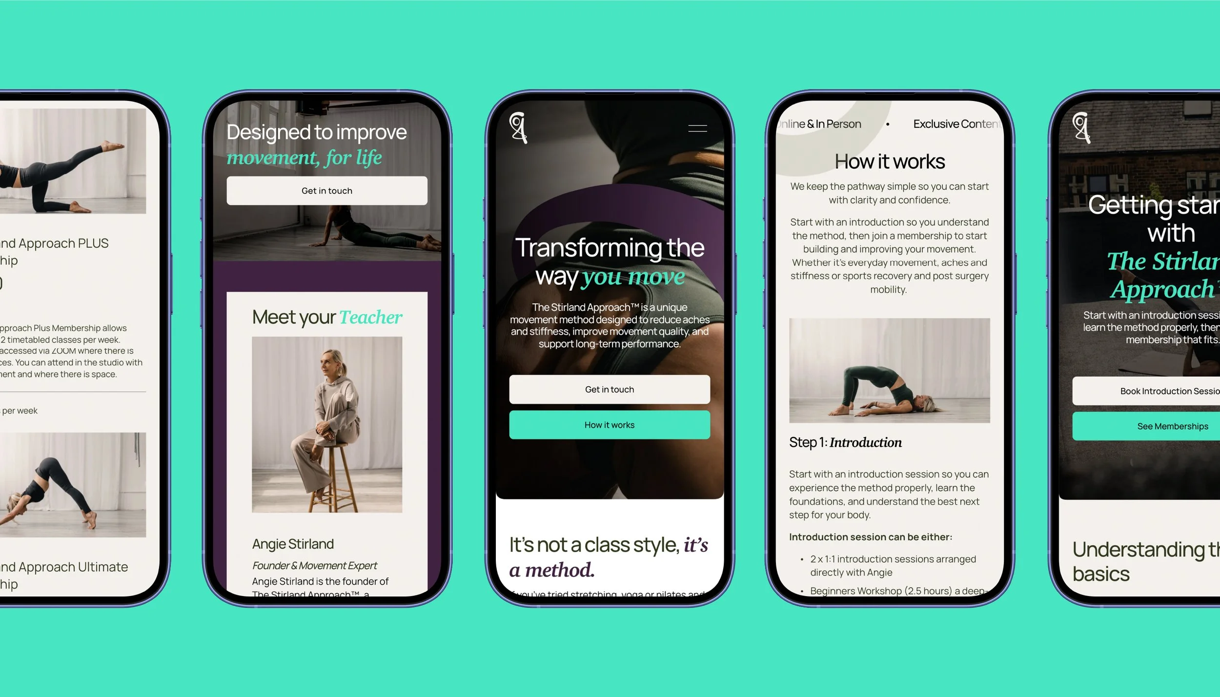
Clarity on and off the screen
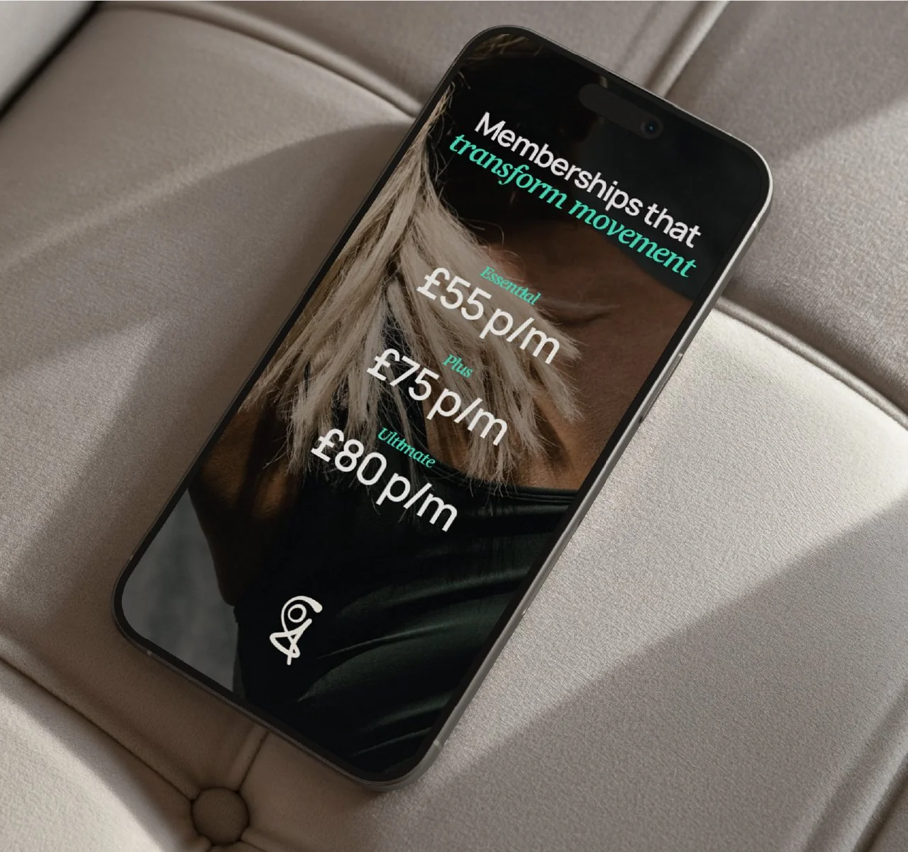
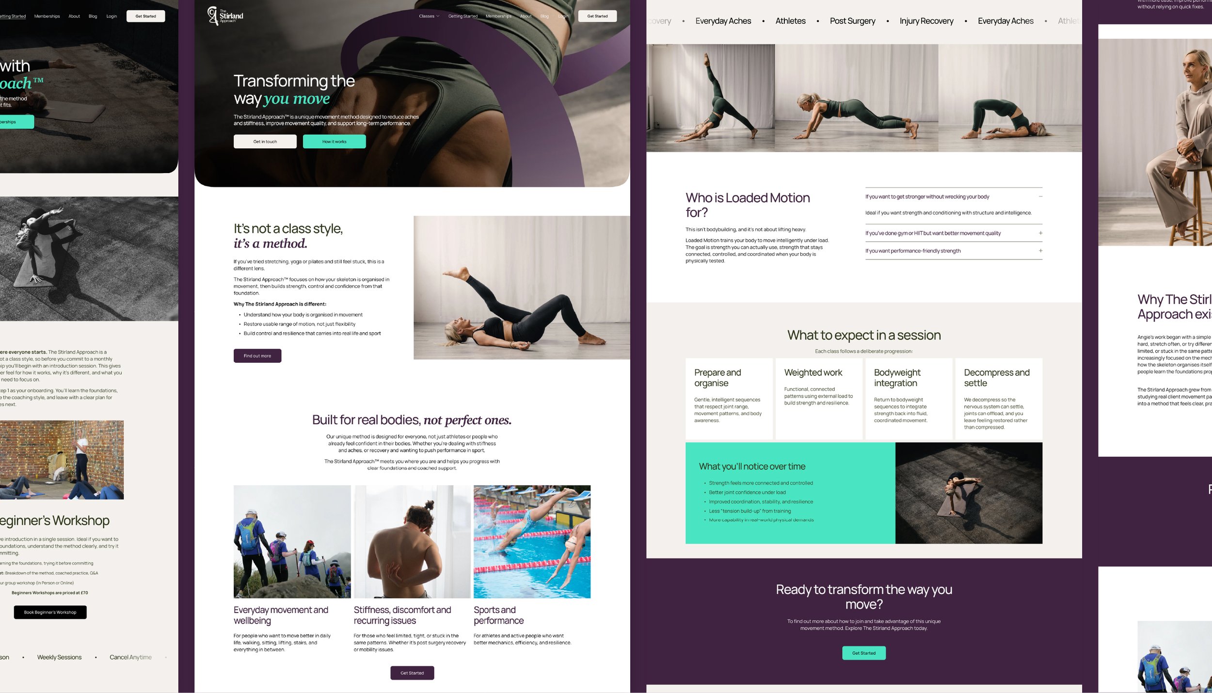
With the brand in place, the website redesign focused on usability, clarity and performance. The homepage was reworked to clearly explain The Stirland Approach methodology, helping new visitors quickly understand what the business offers and who it is for. Navigation was simplified to create clearer journeys for both new and returning users, reducing friction and removing unnecessary complexity across the site.
Acuity scheduling was fully integrated to streamline bookings and remove manual steps, making it easier for users to move from interest to action.
On-page SEO improvements were applied across key pages, including optimised titles, meta descriptions and image handling. The result is a website that feels intuitive, professional and easy to use, while still reflecting the depth, care and personality behind The Stirland Approach.
Website Design
Have a scroll.


“I enjoyed every moment of the process. Aidan did an incredibly thorough job and the attention to detail was unreal. I’d recommend any company looking to work on their branding, visuals and website to speak to you. I’m very proud of my brand and my website because of the work you’ve done”
Angie Stirland
Founder | The Stirland Approach
Let’s work together.
Ready to start your project? Needing some help with your business? Or fancy finding out more.
Get in touch today for a free discovery call.
